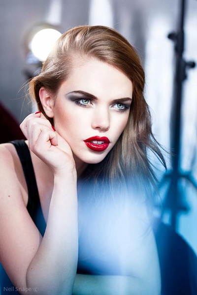
At first glance, this picture seems both straightforward and complicated. Makeup is the key here—it’s all about cosmetics (the lighting only highlights this).

Photographer: Neil Snape
In order to make a dramatic image like this, especially one that looks decent on paper printed on a rotary (helio) press, a hint of hard light keeps the contrast believable and adds a bit of dimension.
During my time at Publicis—the agency that does most of the beauty and cosmetics advertising in Paris—the chief art buyer told me that you need to make your pictures appear as if they’ve been shot in daylight rather than a dark studio.
Every time I shoot, I remind myself of this, and since then I’ve shot more with daylight than studio clinical flash. Furthermore, clients sincerely appreciate photographers who can shoot both stills and video. This is also something I will work on, hence the raison d’être for this picture.
Camera
First, the details: I captured this image using a handheld, but I shouldn’t have done that. Why? Even when shooting with flash, there is always some motion blur. Also, learning to shoot video insists on more rigor, and a fluid head is the key to making smooth video, short of using a steady cam.
It was shot on a Canon 5DMKII, ISO 200, wide open at f2.8 on a 100mm Macro non IS.
Distance from camera to subject was about 1.5 m (approximately 5 feet). Now, handheld is already hard enough, but I also had to wave the aqua azure filter (Rosco sample filter pack) in front of the lens to try to find a reflection of the window behind me. The filter was close to the lens, but not so close that it obstructed the window reflection behind.
The girl was propped up on her elbows, with one hand resting against her cheek, so it was fairly easy for her to maintain this comfortable pose. She did have some trouble with the lights in her eyes, which made it difficult for me to get pictures of her without her squinting.
Lights
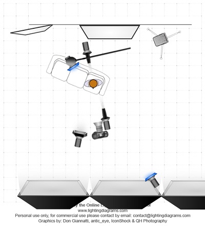
This is a case where the main light is not necessarily the brightest light. It is a mix of lights, and contrary to best practices, there is no true main light priority.

The best directional light is a spot Fresnel— a 150 W modeling light that has an 80B blue correction filter with a 2X neutral density. The Fresnel was open to allow a large circle of area, so the model could move without drastic light changes. For still photography sometimes the light can be more precise, but that requires models that don’t move about. It is about 0.5m slightly to the right of camera and just above the horizon as seen in the nose shadow.
There is also a light to the right of the model, higher and outside the windows 80B filter. I used it to add additional ambience to the background, and I turned it to add just a hint of shading to the face.
To the left of the camera is a P65 (large bowl reflector), filtered 80B and four leaf barn doors. The doors are closed in a lot to restrict the light to the face more than the arm.
Behind the camera is a huge window that faces southwest. There were overcast skies that day. That is what makes her eyes so clear and the fill light creating very gentle wrap around light.
Behind the couch are two lights, and two reflectors or mirrors.
The first is one for effect and drama, a snoot on a Pulso head with an 80B filter. Normally, I’d remove the handle on the flash using Photoshop, but I left it in for now. That’s what’s adding a bit of flare, and I shot without a lens shade on purpose to allow the flare in the pictures.
The second light is a Pulso head on a boom (you can see the boom stand) but not filtered. It is in fact this light that is making most of the flare, and the rim lighting.
All modeling lights were at full power, yet the filter reduces the light by two stops. Ambient light was just under the continuous light f2.8 ISO 200 1/125th s).
There is a mirror to the left and behind and a metallic fabric on a polystyrene board to the right, which provides ambience. We tried to find the right angle for the board, and the right small folds to break up the large reflection.
Not much retouching needed, just a bit of tinkering in LightRoom.
No comments:
Post a Comment