Using window light – part 1: The basics of light shaping
The use of window light for model photography provides many
joys along with many frustrations. In this series I hope to give some
suggestions to help maximize the joys while dealing with the headaches.
This series will present techniques for using only un-augmented window
light to create beautiful images. For the purposes of these articles,
the term “window” is used to mean any opening of an interior space to
the outdoors. This can be a window, door or even simply a missing bit of
wall in an abandoned factory.
In this first part I will touch briefly on some contributing factors and then attempt to expand on them in later articles.
As with any light source, understanding and controlling the qualities of the light is the first consideration. Softness/hardness, directionality and color temperature all contribute to the final product. Since most photographers are familiar with studio lighting equipment and techniques I will use these as analogs in describing our ambient light techniques.
Let’s begin with the simplest scenario, a single light source.
A single window can provide anything from broad, flat light to very focused “art nude” shaping depending upon angle of light and the apparent size of the light source. Some examples with explanations:

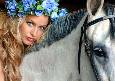
Model: Natalie Beth
In this image the light source was a large door in a riding arena. Natalie and her horse were placed just inside the door and I was standing just outside that door. The effect is as if I had a very large soft box in a darkened studio and shot the photo while standing between the soft box and the subjects: relatively flat, omnidirectional light.
Something to remember is that as with any light source, the apparent size of the source determines the hardness or softness of the shadows. An apparently small source will produce very crisp shadow lines while an apparently large source will produce very soft shadows. In the image above, the very large source made quite soft and flattering shadows.
A very different approach would be to position the light source at roughly 90 degrees to the subject and placing the subject at a distance from the source (reducing its apparent size):

Model: Anne Schaar
A few more single source examples:

Model: Natalie Beth
The source for this image is between the very broad and very narrow examples above. The window was above and behind Natalie and covered most of the width of the wall at camera right. Contributing somewhat to the softness is the fill provided by the white stairwell walls.

Model: Natalie Beth
Once again very directional light but this time the apparent size of the source is larger (an 8′ X 3′ window just out of the frame at camera right). This softens the contrast and shadows while bringing the detail of the background wall up as well.

Model: Samantha Christian
Virtually the same arrangement can produce quite different results. The light source for this one was a glass 7′ X 7″ patio door approximately eight feet from Samantha at camera right.
Because the room is almost all white (the floor tile was even very light), the light becomes very diffuse. Crowding overexposure and using a wide aperture (f2.8) also causes a bit of lens flare, further softening the image.
Once again exposure control is important – this time keeping separation in the lighter values.

Model: Sweet Romance
This is technically a two source image – but the second source is simply illuminating the background and not providing rim light on the subject. Note that the shadow caused by window height was used to produce a dramatic diagonal line in the background.
The key light here is a window identical to the one partially visible in upper center but just out of frame to camera left.
Careful positioning of Jen against the background allowed a nice and subtle separation from the background, emphasizing her figure even in the dark garment.
Multiple sources: Using windows for rim lighting
In the studio we will often use two or more strobes with light modifiers to add depth. This can also be accomplished using window light if you are fortunate enough to have a corner room (those much sought after corner offices in business ladder climbing).

Model: Isabella V
Here the key light can be seen at camera left. An identical window in the far wall is just out of frame at camera right (you can see where the casing had been).
The second light creates very nice separation from the background and an excellent feeling of depth.

Model: Natalie Beth
Here Natalie is standing approximately 1/3 of the width of the building from the key lights (camera left). Once again the light hues of the room provided a lot of fill light.

Models: Susie B & Anne Schaar
Shot from a ladder in a very white room. The key light was from a wall of windows at camera top (is that a term?) plus fill from a wall of windows at camera right.
The light here is not particularly directional. This is due to the fact that the room is almost completely white. It suited the mood I was working toward: Morning light in a bedroom.

Model: Tiana Hunter
One more “straight on” shot. This was in a stairwell in an old factory. The only light was a large window directly behind and above the camera position.
Almost a “beauty dish” setup combining softness with crisp detail.
Stay tuned for Part 2: Some natural light special effects and dealing with the challenges presented by these techniques.
In this first part I will touch briefly on some contributing factors and then attempt to expand on them in later articles.
As with any light source, understanding and controlling the qualities of the light is the first consideration. Softness/hardness, directionality and color temperature all contribute to the final product. Since most photographers are familiar with studio lighting equipment and techniques I will use these as analogs in describing our ambient light techniques.
Let’s begin with the simplest scenario, a single light source.
A single window can provide anything from broad, flat light to very focused “art nude” shaping depending upon angle of light and the apparent size of the light source. Some examples with explanations:

Model: Natalie Beth
In this image the light source was a large door in a riding arena. Natalie and her horse were placed just inside the door and I was standing just outside that door. The effect is as if I had a very large soft box in a darkened studio and shot the photo while standing between the soft box and the subjects: relatively flat, omnidirectional light.
Something to remember is that as with any light source, the apparent size of the source determines the hardness or softness of the shadows. An apparently small source will produce very crisp shadow lines while an apparently large source will produce very soft shadows. In the image above, the very large source made quite soft and flattering shadows.
A very different approach would be to position the light source at roughly 90 degrees to the subject and placing the subject at a distance from the source (reducing its apparent size):
- The light for this image was provided by a window approximately 30 feet away from Anne. It was further shaped but traveling through a confined stairway and so was quite directional.
- In this situation care must be taken to retain shadow detail so that the deep shadows on the model’s “dark side” do not blend completely into the background. In the print version, the background is right around Zone I with Anne’s left arm and side approaching Zone II.

Model: Anne Schaar
A few more single source examples:

Model: Natalie Beth
The source for this image is between the very broad and very narrow examples above. The window was above and behind Natalie and covered most of the width of the wall at camera right. Contributing somewhat to the softness is the fill provided by the white stairwell walls.

Model: Natalie Beth
Once again very directional light but this time the apparent size of the source is larger (an 8′ X 3′ window just out of the frame at camera right). This softens the contrast and shadows while bringing the detail of the background wall up as well.

Model: Samantha Christian
Virtually the same arrangement can produce quite different results. The light source for this one was a glass 7′ X 7″ patio door approximately eight feet from Samantha at camera right.
Because the room is almost all white (the floor tile was even very light), the light becomes very diffuse. Crowding overexposure and using a wide aperture (f2.8) also causes a bit of lens flare, further softening the image.
Once again exposure control is important – this time keeping separation in the lighter values.

Model: Sweet Romance
This is technically a two source image – but the second source is simply illuminating the background and not providing rim light on the subject. Note that the shadow caused by window height was used to produce a dramatic diagonal line in the background.
The key light here is a window identical to the one partially visible in upper center but just out of frame to camera left.
Careful positioning of Jen against the background allowed a nice and subtle separation from the background, emphasizing her figure even in the dark garment.
Multiple sources: Using windows for rim lighting
In the studio we will often use two or more strobes with light modifiers to add depth. This can also be accomplished using window light if you are fortunate enough to have a corner room (those much sought after corner offices in business ladder climbing).

Model: Isabella V
Here the key light can be seen at camera left. An identical window in the far wall is just out of frame at camera right (you can see where the casing had been).
The second light creates very nice separation from the background and an excellent feeling of depth.

Model: Natalie Beth
Here Natalie is standing approximately 1/3 of the width of the building from the key lights (camera left). Once again the light hues of the room provided a lot of fill light.

Models: Susie B & Anne Schaar
Shot from a ladder in a very white room. The key light was from a wall of windows at camera top (is that a term?) plus fill from a wall of windows at camera right.
The light here is not particularly directional. This is due to the fact that the room is almost completely white. It suited the mood I was working toward: Morning light in a bedroom.

Model: Tiana Hunter
One more “straight on” shot. This was in a stairwell in an old factory. The only light was a large window directly behind and above the camera position.
Almost a “beauty dish” setup combining softness with crisp detail.
Stay tuned for Part 2: Some natural light special effects and dealing with the challenges presented by these techniques.
No comments:
Post a Comment