What should my histogram look like?
This article is written by a member of our expert
community. It expresses that member’s views only. We welcome other
perspectives. Here’s how to contribute to MM EDU.
What exactly am I supposed to be looking for when I check my histogram for proper exposure? What does a correct one look like?
The contents of a histogram simply reflect what was captured or is in the file. It’s a graphical representation of how many pixels there are for each brightness level, scaled to fit the available space. The higher the peak, the more pixels of that brightness are there. Black is on the left, white is on the right, and everything else is in between. (“Middle gray” will usually be around 110 to 130, depending on the gamma of the file; it is not automatically 127/128.)
What was captured or is in the file reflects what was in the scene combined with how it was exposed (and possibly color space).
A typical middle-key image will show that the majority of tones are in the mid-range, with some darker and lighter areas.
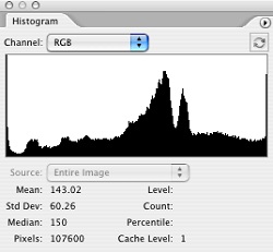
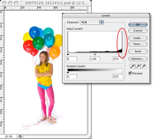
A high-key image, even properly exposed, may well have a significant fraction of the image at 255 (see the image and histogram with the white background), while a histogram like that could easily mean overexposure for a “normal” or low-key image.
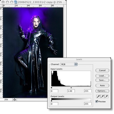
The opposite applies for a low-key image, where a lot of image data could legitimately be at 0.
That said, most “normal” images with a lot of pixels at 0 or 255, or a lot of pixels crowded near one edge of the histogram and nothing or very little near the other, are usually improperly exposed or scanned.
If you keep in mind that ANYTHING at 0 or 255 is without detail, that will help. There aren’t that many other “rules” that are universal. That also means that anytime one channel has something at 0 or 255, you have less detail, and if there are two channels that way, you’ve lost a lot of detail. When all three are at 0 or 255*, you have no detail. (*That includes such examples as (0,255,0)—pure green, no detail; it doesn’t have to be (0,0,0) or (255,255,255).
As an example of non-universal rules, different applications and different cameras treat composite histograms in different ways. Some show luminosity, some show peak values per channel, and some show the green channel as if it were the composite. Additionally, most cameras display histograms based on the in-camera JPEG settings, which may not reflect what is captured in a Raw capture.
For most images, it’s not critical to know that Luminosity and per-channel views are different; the differences are usually fairly minor. For images with very saturated colors, however, the two can give very different results, and knowing which is being displayed can help you avoid problems.
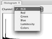
A recent version of Photoshop will let you choose how and what to display.
On my website, I’ve got a Histogram Quiz that contains sample histograms that can be used to help visualize the contents of an image based on the histogram. Those samples emphasize the unusual, however, as many common histograms will look fairly mountain-like: high in the center and low at the ends.
All that said, from a working perspective, a “good” histogram will have information stretching from as dark as you want anything in the image to be (usually a pure black) to as light as you want to have in the image (usually a pure white). A histogram that doesn’t cover the full range is generally describing a “flat,” or low contrast, image. Unless that’s intentional, stretching the data via Curves or Levels will usually help.
What exactly am I supposed to be looking for when I check my histogram for proper exposure? What does a correct one look like?
The contents of a histogram simply reflect what was captured or is in the file. It’s a graphical representation of how many pixels there are for each brightness level, scaled to fit the available space. The higher the peak, the more pixels of that brightness are there. Black is on the left, white is on the right, and everything else is in between. (“Middle gray” will usually be around 110 to 130, depending on the gamma of the file; it is not automatically 127/128.)
What was captured or is in the file reflects what was in the scene combined with how it was exposed (and possibly color space).
A typical middle-key image will show that the majority of tones are in the mid-range, with some darker and lighter areas.

A high-key image, even properly exposed, may well have a significant fraction of the image at 255 (see the image and histogram with the white background), while a histogram like that could easily mean overexposure for a “normal” or low-key image.

The opposite applies for a low-key image, where a lot of image data could legitimately be at 0.

That said, most “normal” images with a lot of pixels at 0 or 255, or a lot of pixels crowded near one edge of the histogram and nothing or very little near the other, are usually improperly exposed or scanned.
If you keep in mind that ANYTHING at 0 or 255 is without detail, that will help. There aren’t that many other “rules” that are universal. That also means that anytime one channel has something at 0 or 255, you have less detail, and if there are two channels that way, you’ve lost a lot of detail. When all three are at 0 or 255*, you have no detail. (*That includes such examples as (0,255,0)—pure green, no detail; it doesn’t have to be (0,0,0) or (255,255,255).
As an example of non-universal rules, different applications and different cameras treat composite histograms in different ways. Some show luminosity, some show peak values per channel, and some show the green channel as if it were the composite. Additionally, most cameras display histograms based on the in-camera JPEG settings, which may not reflect what is captured in a Raw capture.
For most images, it’s not critical to know that Luminosity and per-channel views are different; the differences are usually fairly minor. For images with very saturated colors, however, the two can give very different results, and knowing which is being displayed can help you avoid problems.
A recent version of Photoshop will let you choose how and what to display.

On my website, I’ve got a Histogram Quiz that contains sample histograms that can be used to help visualize the contents of an image based on the histogram. Those samples emphasize the unusual, however, as many common histograms will look fairly mountain-like: high in the center and low at the ends.
All that said, from a working perspective, a “good” histogram will have information stretching from as dark as you want anything in the image to be (usually a pure black) to as light as you want to have in the image (usually a pure white). A histogram that doesn’t cover the full range is generally describing a “flat,” or low contrast, image. Unless that’s intentional, stretching the data via Curves or Levels will usually help.
No comments:
Post a Comment